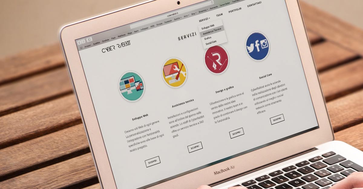
How to Build a Business Website That Generates More Enquiries?
It is important to have a website that is good looking.
But there is something else that can make or break your business – your website’s ability to bring you leads and new customers.
If you have a website that is helping you convert more website visitors into leads and enquiries you will end up with more prospects and thereby more revenue.
The purpose of this quick article is to let you know about certain effective methods to turn your website more lead generation (enquiry generation) friendly.
Or if you are investing in building a new website, make sure your developer implements these conversion-friendly practices.
Clear Headings and Conversion Focused Content
Don’t neglect the importance of clear headings and conversion-focused website content.
There are a thousand websites that make it super hard for the website visitors to guess what the website is all about.
Seriously, you don’t want to spend your money and build a website like that.
Invest in good content, just like how you invest in good design.
In an ideal scenario, a person who lands on your website should be able to understand ‘what your business does’ by just reading your above the fold* headline, and that too in less than 3 seconds. The more time it takes, the more uninteresting it becomes.
What is ‘above the fold’?
‘Above the fold’ is the area on your website that a visitor sees first. To be more specific, it is the top portion of a web page that a visitor sees first (after landing on the page) without scrolling down. See the below image to have a better understanding.
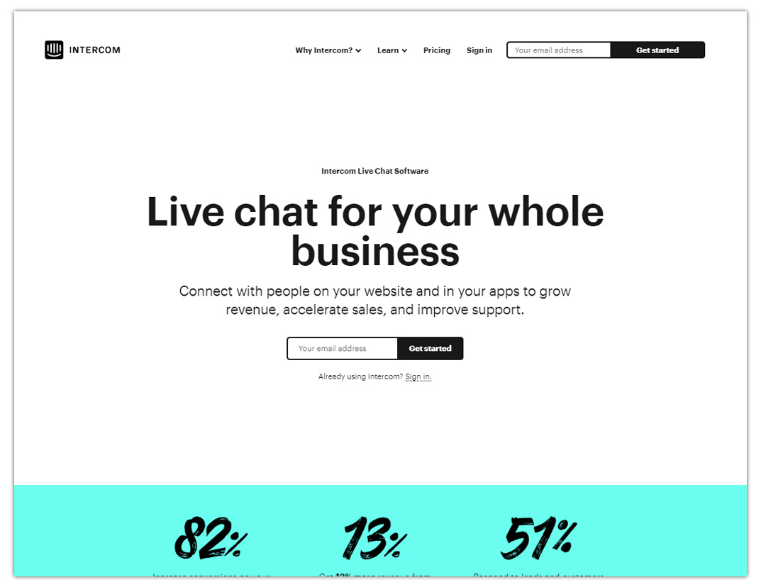
The area with a white coloured background is above the fold. Courtesy: Intercom’s website
So, make sure your headlines are crisp, clear and to the point. And it should be explaining the benefit your product or service is offering to your users, in a quick and easily understandable manner.
Better hire a good content writer (or copywriter) to get your headlines done.
This will certainly pay off if you are intending to generate leads and customers from your website.
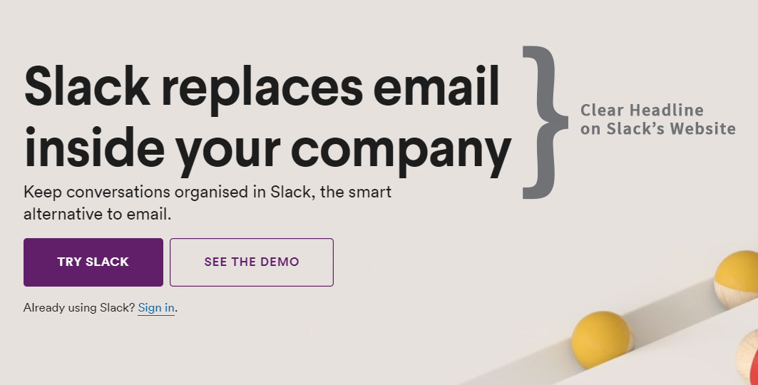
A clear headline on Slack’s website | Courtesy: Slack
Also, make sure your overall website content is adding value to your website visitor. Ideally, it should tell your website visitor how your product or service is going to help him/her.
Clear and Specific Call to Action (CTA) Buttons
You want your website visitors to click on your website buttons and fill up your enquiry forms, right?
To make this process easy, one of the proven ways is to have clear, specific and super catchy call to action buttons.
There are three points that matter in a call to action button
- The button text
- Button placement (its location on your website)
- Its colour
The button text has to be clear and specific. If you have a major offer on one of your webpages, like book a tour or watch demo, it should be clearly explained on your CTA button. Also, it works really well when you give the exact instructions to your website visitors, like what to do to avail an offer or what will happen when they click on a specific button.
Button placements have a major role in people clicking on them. Place them above the fold, and make sure the visibility of buttons isn’t compromised if you are adopting some contemporary designs.
Do colours really have an impact?
Well, studies say yes. Make sure your website buttons have contrasting and easily striking colours. This will make more people click on them.
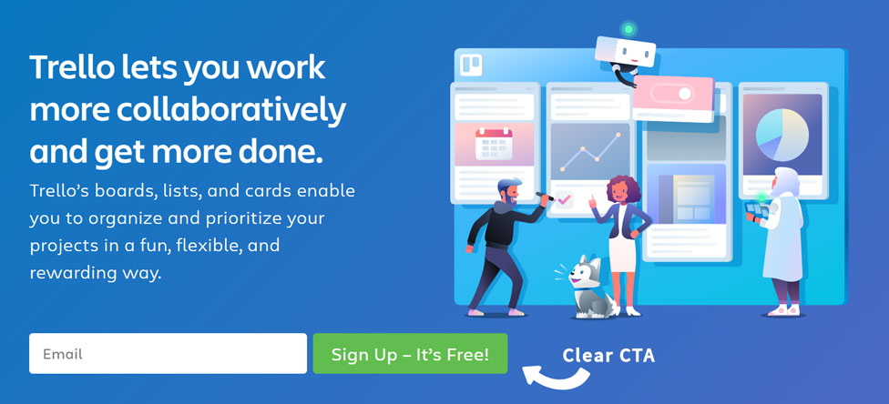
A clear CTA button on Trello’s website | Courtesy: Trello
Testimonials and Client Logos
No one really wants to fill up the forms on your website without knowing about your business first. One of the proven ways to make people fill up your forms is to build trust and credibility among them about your business.
Now, testimonials and client logos are a great way to tell people that you are a trusted business by many and even you have worked with some of the reputed businesses around.
Collect testimonials from your customers on other sites where there are options to collect reviews. You can do this on Facebook or Google My Business easily and then feature those reviews on your website’s pages.
Include the reviewer’s name, designation and an image to make it more authentic.
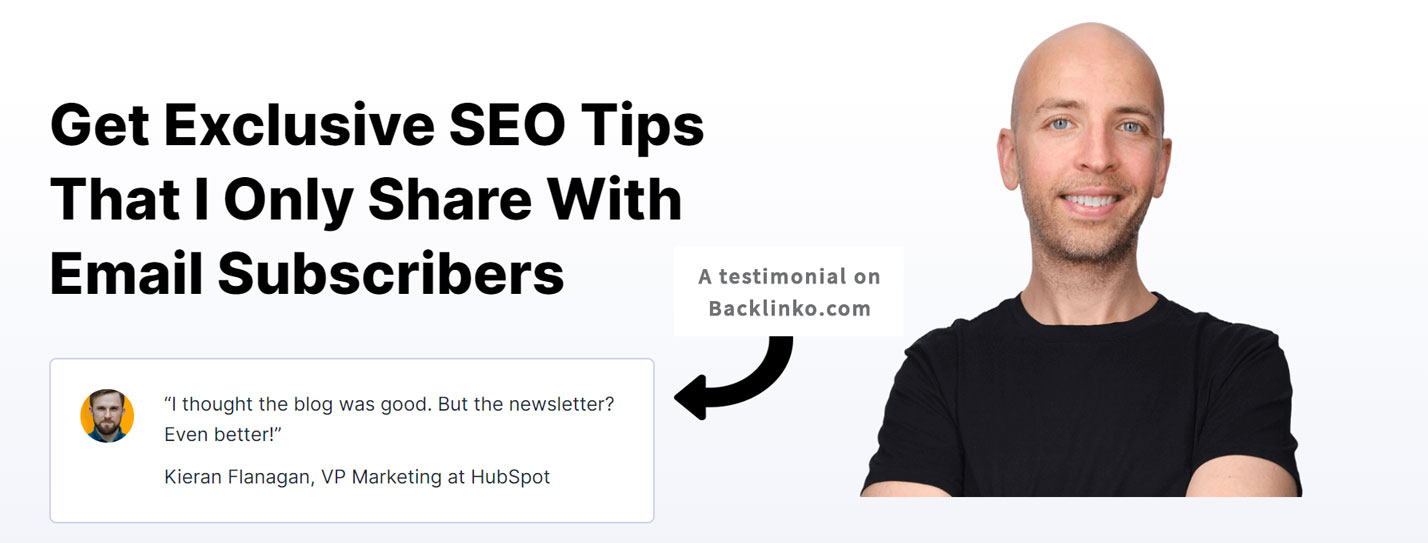
A testimonial on Backlinko.com | Courtesy: Backlinko.com
Then, add the logos of your clients if you are in the B2B (Business to Business) space.

Client logos on Hubspot’s Website | Courtesy: Hubspot
Lead Magnets
Lead magnets are an offer that you can give away to your website visitors for free in exchange of their contact information.
You can do this with free e-books, courses or other free downloads. Your website visitors will have to enter their contact information like name, email or phone number to download one of these free e-books or courses.
This is a great way to add value to your target audience and collect valuable leads.
This can be set up on any website easily with a little bit of technical expertise.
Below are the images of a lead magnet on HubSpot’s website.
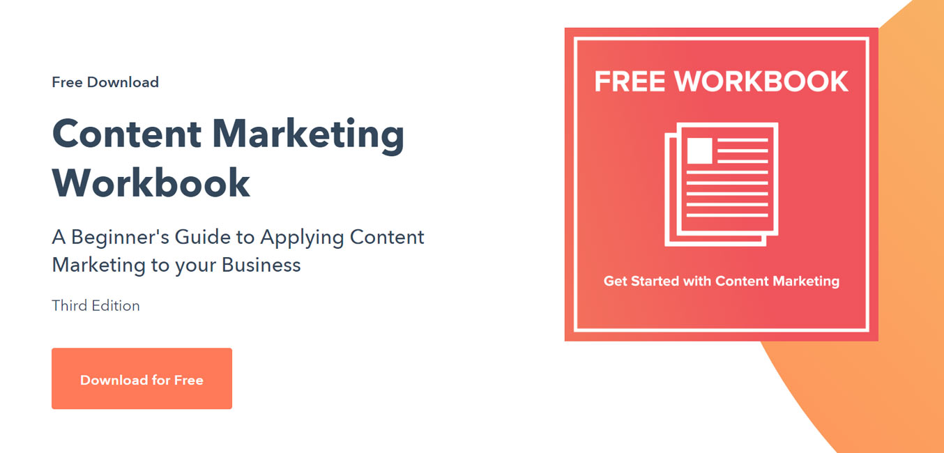
A lead magnet on HubSpot’s Website (Image #1)
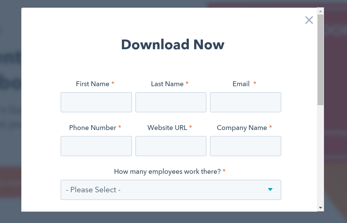
Users will have to enter their contact information to download the lead magnet (free workbook) | Courtesy: HubSpot’s website (Image #2)
Website Loading Speed
Slow websites are a pain, honestly.
A slow website is a bad thing to have than an ugly website.
The ideal load-time for a business website would be 2 to 3 seconds. It is better to keep it under 2 seconds, and if it is above 5 seconds, you may keep losing your website visitors.
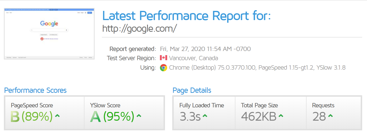
People leave slow websites even before the website appears fully in-front of their eyes. Having a slow website is one of the quickest ways to lose your website visitors and valuable leads.
If you are building a new website, invest in a good hosting plan and make your website light. Especially if your website is going to be built on a platform like WordPress, ask your developer to use a lightweight theme and use some caching plugins.
Final words
Keep these points in mind when you speak to a developer about building a new website for your business.
Adding these elements discussed above on to your website will make it more conversion-friendly and help you get more leads.
If you want to know more about building conversion-friendly websites, you can apply for a free consultation with our website experts. And yes, it is absolutely free and there is no compulsion to buy one of our services.
Also, feel free to comment below if this added value to you or if you have any queries on it.